I created this document as part of my coursework, where I was required to look into an aspect of the music industry.

Monday, 16 December 2013
Representation of Women in the Music Industry
I created this document as part of my coursework, where I was required to look into an aspect of the music industry.
A Fear of Young People
Tanya Byron's article, 'We see children as pestilent', speaks predominantly about the constant disdain felt through history towards young people. She mentions three striking examples that sound very similar to the things often written and spoken in regards to young people, using words that mention a lack of respect, rudeness, impatience, decaying society, riots, immodest and selfish. These span as far back as Ancient Egyptian periods, with mentions of 4th Century Plato and AD 1274 priest Peter the Hermit.
Byron believes this has culminated in a "historically nurtured and culturally damaging phenomenon", ephebiphobia, or the fear of youth. She believes the issue is worse today than ever before.
Byron states that young people are "feared because of the actions of a minority population - the violent, aggressive and antisocial", which is a population that has always been in existence throughout all manner of age and social groups.
This mistreatment and unjust stereotyping of young people has created a self fulfilling prophecy whereby the labels given to young people are internalised and become part of their self concept. After all, "why both to try when you are told you are a failure? Why bother to strive when your existence is seen as a nuisance?"
This already vulnerable group of people is targeted further, Byron claims, by the education system and its culture of targets and testing, "staffed by creatively compromised and disempowered teachers". They are often blocked from striving to achieve higher goals by "elitist and narrowly defined notions of academic competence" found in higher education systems preventing many young people from even trying to access these institutions for fear of denial and mockery.
Byron states that children are first labelled in nurseries and schools, and therefore these labels often stick as they are generally very condemning and tend to encompass a persons identity in the eyes of colleagues and parents. If a child is labelled as a troublemaker during their first year, they will most likely be treated as such, with subsequent teachers expecting them to misbehave. They may even automatically place them in lower streams and set them lower grades to fit in with this label.
As Byron states in her article, many children "develop behaviours to compensate" for the difficulties they encounter in school and often get labelled as a class clown "or worse".
She claims that "children labelled as failures in primary and secondary education have no hope of further or higher education", most likely due to resources, time, and expectations being allocated elsewhere in cases where young pupils are labelled as no-hopers. The younger age at which a child is labelled, negatively or positively, tends to have an extremely large impact on their future achievements.
Rosenthal and Jacobson conducted an experiment in an American school, testing children with an IQ test. Teachers were lead to believe that certain students were entering a year of high achievement (20% of the sample was selected at random and labelled as 'blooming') and other students were not. In reality, the test had no predictive validity.
The same test was used at the end of the school year, only this time the results were not toyed with. Differences in IQ for the children who had been targeted as 'blooming' could then be examined.
The results demonstrated expectancy effects, with the labelled children showing greater gains in IQ than those who had not been. This only occurred within the youngest age groups; reflecting the importance of a child being given support, help and most importantly, not being judged at such a young age.
Light Up The Background - Rough Edit
This link will take you to my rough edit of the music video I have been creating for The LaFontaines' song, Light Up The Background.
The video is only rough in the sense that it is still missing clips. The content already present in the video is more or less finished and what I will be using in the finished version.
Friday, 13 December 2013

Thursday, 12 December 2013
Human Traffic
1. Human Traffic can be
considered a social realist film as it tackles some of the issues faced by
society today in a way that is not entirely glorifying it. Social realism is
defined as: the realistic depiction in art of
contemporary life, as a means of social or political comment. There is
definitely a social comment made in Human Traffic, in the form of it being a
social commentary on youth culture and their habits surrounding drugs.
2. The youth culture depicted in this film seems to be resisting mainstream society. For instance, they all seem unhappy with going along with their 9 to 5 jobs, and showing Nina quit emphasises how she is not going to just put up with it like mainstream society. They also all take drugs at the weekend, meaning that they represent a small proportion of the population. The character of Moff resists the mainstream society in that he is a drug dealer, selling drugs to get by, rather than getting a regular job like everyone else. The relationship he has with his parents is also not one that would be considered mainstream – instead of getting along with them, he is laughed at by his mother and looked down upon by his father.
We see a good example of how the girls in the film resist mainstream society by being sarcastic and demeaning when they are being interviewed in the club. They give the answers that they think the interviewer is looking to hear (that they take heroin etc, showing that soft drugs lead to harder drugs) but they are actually doing it as a form of resistance, as they feel the exact opposite.
3. The values present in this film include gratification, although it is hard to tell whether it is delayed or immediate. It is delayed in the sense that they work hard during the week to ensure they can have a good weekend, but of course it is immediate in the sense that they are not working towards something larger, such as a house or car.
4.The film is British in the sense
that it involves a British subculture, and British slang. It features a lot of
British music and it is directed by a British director.
5. I decided to analyse the scene where Koop and Jip are talking, bent over a glass table and preparing some drugs for them to take. This shot was particularly striking in my opinion because it felt so voyeuristic. The camera seems to be positioned under the table, so we can see in detail the preparation of the drugs as well as the faces of both Jip and Koop. The shot is continuous and we do not see any cuts. The shot is long and uninterrupted, which suggests that there is calm at that moment, which is juxtaposed with the scene before where Moff and another partygoer are very much still in the party atmosphere.
 We see Koop lining up the drugs, and this is interesting
because he is doing it in an absent-minded manner as he chats to Jip about his
worries over his father. Koop claims to be worried because ‘those drugs they’re
giving him…f***ing his head up mate’. This is ironic as the drugs that Koop is
shown to be taking throughout the evening, as well as the ones he is about to
take, have all lead to the immense paranoia he feels over his relationship with
girlfriend Nina, as he believes that she is going to sleep with other men
behind his back. This is constantly brought up throughout the film and it can
be said that the illegal drugs Koop is taking are having a similar effect on
him as the prescribed ones are on his dad.
We see Koop lining up the drugs, and this is interesting
because he is doing it in an absent-minded manner as he chats to Jip about his
worries over his father. Koop claims to be worried because ‘those drugs they’re
giving him…f***ing his head up mate’. This is ironic as the drugs that Koop is
shown to be taking throughout the evening, as well as the ones he is about to
take, have all lead to the immense paranoia he feels over his relationship with
girlfriend Nina, as he believes that she is going to sleep with other men
behind his back. This is constantly brought up throughout the film and it can
be said that the illegal drugs Koop is taking are having a similar effect on
him as the prescribed ones are on his dad.
The characters in it have fairly
depressing situations although they are told in through black comedy; for
instance there is a scene in which Jip is being sexually assaulted (in a dream
like scenario) by his male boss, as a metaphor for how his job is exploiting
him, and his mother, who he has only just come back into contact with, is a
prostitute. His friend, Koop, has a father who is suffering from mental health
issues after his wife left him, and Koop is having to deal with the fallout and
having a father who does not remember him, as well as being a victim to the
constant paranoia caused by his casual weekend drug taking. Koop’s girlfriend,
Nina, works in a fast food restaurant and she is a victim of actual everyday
sexual harassment from a lecherous boss and finds the monotony of her job too
much to bear. Nina’s friend, Lulu, is fiercely trying to get through college,
and the group’s friend Moff is trying to get by as a small time drug dealer
whilst trying to get along with his straight-laced, nuclear family, headed by
parents who see drugs and youth culture as incredibly black and white issues.
The main issues explored in Human
Traffic include alienation, relationships and drugs. We can see these issues
explored in other social realism pieces, such as The Selfish Giant, This Is
England and Quadrophenia.
2. The youth culture depicted in this film seems to be resisting mainstream society. For instance, they all seem unhappy with going along with their 9 to 5 jobs, and showing Nina quit emphasises how she is not going to just put up with it like mainstream society. They also all take drugs at the weekend, meaning that they represent a small proportion of the population. The character of Moff resists the mainstream society in that he is a drug dealer, selling drugs to get by, rather than getting a regular job like everyone else. The relationship he has with his parents is also not one that would be considered mainstream – instead of getting along with them, he is laughed at by his mother and looked down upon by his father.
We see a good example of how the girls in the film resist mainstream society by being sarcastic and demeaning when they are being interviewed in the club. They give the answers that they think the interviewer is looking to hear (that they take heroin etc, showing that soft drugs lead to harder drugs) but they are actually doing it as a form of resistance, as they feel the exact opposite.
3. The values present in this film include gratification, although it is hard to tell whether it is delayed or immediate. It is delayed in the sense that they work hard during the week to ensure they can have a good weekend, but of course it is immediate in the sense that they are not working towards something larger, such as a house or car.
They are hedonistic and they are
shown to leave jobs easily. In this sense, they are seen to have little concern
for money, especially considering the amount they are implied to spend on a
Friday night. They feel victimised by the media and by wider society, as shown
in the scene where they sing the new ‘National Anthem’ and they are disdainful
towards older people, who are shown to not understand them.
5. I decided to analyse the scene where Koop and Jip are talking, bent over a glass table and preparing some drugs for them to take. This shot was particularly striking in my opinion because it felt so voyeuristic. The camera seems to be positioned under the table, so we can see in detail the preparation of the drugs as well as the faces of both Jip and Koop. The shot is continuous and we do not see any cuts. The shot is long and uninterrupted, which suggests that there is calm at that moment, which is juxtaposed with the scene before where Moff and another partygoer are very much still in the party atmosphere.

Similarly, when the scene opens we see Koop asking Jip what
he was talking about, as Koop appears to have lost his train of thought. It
takes a few moments for either of the men to establish what they had been
talking about. This parallels the fact that Koop’s dad thinks that Koop is two
twins pretending to be the same person – called Neil.
This is also interesting in the sense that this is an
interesting look into drug culture on a far wider scale – not just in young people.
Koop’s dad is on prescribed drugs but they appear to be having just as much of
a negative effect, if not worse, than the illegal ones that his son and his son’s
group of friends engage in every weekend. Thursday, 5 December 2013
London Riots


Underneath the image, we can see the latest 'breaking news', with 1,051 people charged so far in relation to the riots.
 However this is not a live report and therefore it could have easily been constructed and mediated to give off a certain message.
Darcus Howe is a writer and broadcaster that some BBC News reporters spoke to live from the scenes of one of the areas where rioting took place. He speaks passionately about the issues. He claims to have been sure that 'something was going to take place. Our political leaders had no idea. The police has no idea. But if you looked at young blacks and young whites with a discerning eye, and a careful hearing, they have been telling us and we would not listen'. He later goes on to state that Duggan had his face 'blown off', to which the reporter chastises him for making assumptions. The name of this video is London Riots (The BBC will never replay this. Send It Out), and it has over 5.5 million views on Youtube. This is another live piece. However, what is interesting is that in the three clips I have looked at, the youths have not been given a fair voice of their own. In the first, no one is interviewed and young people are made to seem brutish as the middle-class, middle-aged reporter and his camera crew are forced out of the area mainly filled with working-class young people. In the second, young people are able to talk - but the story is pre-recorded and therefore it gives Sky News the chance to mediate the clip by taking out anything that makes the men seem in anyway positive, or give their actions any real justification.
The third is a man, who was 68 years old at the time, giving his opinions. Although his opinions seem to give more reason to what the young people are doing, he is not a fair representation of the rioters because he is not a rioter.

- 100 suspects on disability living allowance, 60 on incapacity benefits
- 40% were on benefits on some kind
- Fewer than one in 10 rioters was in a gang
- 53% of suspects were under 21

In these bullet points, the Daily Mail succeeds in vilifying multiple groups of people. They point the blame at gang culture, point the blame at young people, point the blame at benefit claimants and those who live on disability living allowance. Oddly enough, the man writing the article does not fit into a single one of these categories. Embedded in the article are links to further stories - one of which claims that 1 in 7 of the rioters was foreign; again, pointing the blame at another social group.
They call the police 'helpless' in the face of a fire - despite the fact that it is not the job of the police to be controlling a fire in the first place.
They also demonstrate some offensive attitudes towards disabled people - they feature a CCTV image of a man stealing a TV whilst being in a wheelchair, seeming to suggest that people in wheelchairs are incapable of committing crime.
This can be seen as helping to validate the opinions of the people who read the paper, and helps them to lay blame on a certain group of people - rather than being in a mass state of confusion over why it happened.
In contrast, articles from The Guardian seem a little less enraged and a little less emotionally charged. This article, by Nina Power, seems to be a little more sympathetic towards the root causes of the riots rather than simply trying to point the blame in hindsight.
In conclusion, it seems that there was not really a very fair representation of young people in the news during the riots. The most easy to access news stories about the riots were either heavily mediated or include people who do not fit into the social groups of the people who were taking part in the riots.
Some of the stories are incredibly subjective, especially in newspapers, where it is easy to use emotive language. The absence of moving image seems to encourage journalists to use uncommon, rich and powerful words.
Monday, 2 December 2013
Music Video Inspiration - Mikill Pane
I got an idea for a shot in my music video from Mikill Pane's music video, Blame Miss Barclay, at 2:03 to 2:07.
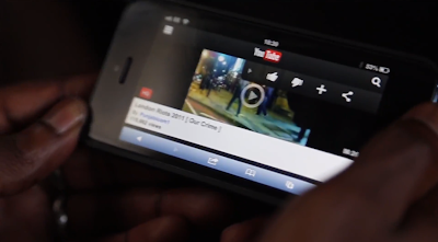 This shot shows someone holding their smartphone and clicking play on a video on the London Riots, which is called 'London Riots 2011 [ Our Crime ]'.
I think that this will be good in my video. I want to show the spread of information through social media, and using a video either the same as this or of the Mr Freeman video used in the beginning will be good.
This is also a close up shot which I think will fit in nicely with my music video, as I want to have a lot of these, as can be seen in my storyboard (1, 2), shot list and treatment.
Music Video Treatment
I put together a music video treatment to help utilise my ideas about style, look and provide a basic outline of plot.
Audience Profiling - Revisited

I
have decided to revisit my audience-profiling task, in order to examine a more
relevant artist to the one I decided to profile, which was Jessie J. Although I
found a lot of things out about Jessie J and her fan base, she is not linked
closely enough to The Lafontaines for any of this research to be helpful.
For
this reason, I have decided to profile The Lafontaines.
Assumptions:
Gender: I don’t feel that there
would be a noticeable difference in gender. Although the band is male, this
would not dissuade women from listening to them. Their songs seem to address
issues that face most people or irritate a larger proportion of people. Their
song, Shark In The Water, addresses the issue of women being overly promiscuous
for attention – but not in a misogynistic way, as the lyrics also pay attention
to the fact that some women feel intimidated and overpowered by their female
friends. Similarly, the song is from a male perspective, attracting male
listeners.
Age: I would put the age of fans for
The Lafontaines as anywhere between 14 and 30, but probably falling mainly
between the ages of 18 and 24. This group is likely to be able to access gigs
and festivals much more easily due to the lesser financial pressures put on
them at this age than when they have a house and a family, and equally any
younger than 18 may mean that they cannot access the gigs or have enough money
to travel to see them.
Fashion: I feel that the fans of The
Lafontaines most likely wear average clothes, much like the band members, who
can be seen wearing t-shirts, jeans and shirts. They also have been known to
wear suits at some of their gigs, such as when they performed their show ‘Club
Fontaine’ in early April 2013 wearing full Morning Suits complete with bow
ties.
The
lead vocalist, Kerr Okan, has a fairly sophisticated hairstyle, which is
slicked back on top and shorter around the back and sides. However, this is not
to say that all fans would replicate this; Jamie Keenan, the drummer and
occasional vocalist, has a much more laid back style, with relatively long,
wavy hair that is much more ‘scruffy’ than Okan’s.
Social Practices: For a less
well-known band like The Lafontaines, it is important to have good social
networking set up. They have a Facebook page, which helps them to reach fans,
as well as a Twitter. They have a page on Bandcamp, as well as a Tumblr page, which doubles as their website, and a Myspace page (although this looks fairly abandoned). They also have a YouTube channel.
As a result, I think fans will be
fairly technologically literate and be able to follow the band on these various
platforms. This helps them to spread their music too, as fans might share
around links to songs they enjoy. Facebook has a feature which shares a story,
such as a person liking a page, so people who do not know of the band might see
something saying “John Jones has liked The Lafontaines” and then click on the
link to check out what John Jones is interested in.
I think that fans of this band might
also listen to radio stations such as BBC Radio 1, which plays a more varied
range of music than Kiss or Capital FM, and has played the band before on late
night shows. The Lafontaines also performed on the BBC Introducing stage at T
in the Park in 2013.
Interests: I would assume that fans of this band would most likely be interested in fairly standard activities, such as meeting friends and socialising. I would also assume that they enjoy going to gigs, since the band still attracts a lot of fans through gigging in small venues around the Glasgow area from where they originated.
Interests: I would assume that fans of this band would most likely be interested in fairly standard activities, such as meeting friends and socialising. I would also assume that they enjoy going to gigs, since the band still attracts a lot of fans through gigging in small venues around the Glasgow area from where they originated.
Fans might also enjoy listening to similar music and doing activities seen in the bands videos, such as going to festivals. I think they might enjoy listening to music of the genres which The Lafontaines’ draw influences from, such as from rock, hip-hop and pop genres.
Below this point is the raw text I used to create this post.
Below this point is the raw text I used to create this post.
Friday, 22 November 2013
Shooting Map

This shooting map shows the position of the camera at the Charge Unit. The map shows roughly how the ramp are laid out and where I put my camera in relation to them. There are arrows showing which way the camera was positioned, and how close to each ramp it was.
I have also added some notes down towards the bottom of the sheet showing what kind of shot each one was, as well as the angle from which I shot it from.
A shooting map is a useful tool because it means I can recreate any scenes at a later date if there is a problem with any of my footage.
Wednesday, 20 November 2013
Locations - Revisited


This map shows the various locations that I will be visiting during my filming. A is the beach location, in Mundesley.

 The next location is B - where my house is. I will be filming on the street outside my house.
This shot to the right shows Burgh Road in Aylsham, which is a dimly lit and fairly clear in the evenings. I think it will be an interesting setting and as the road only bends off slightly I think I may be able to have images of Max running down the road.
 However, this may be difficult to achieve since it is getting dark so early. I may have to improvise and either film indoors or under street lamps to make up for the lack of sunlight - however this should be helpful in a sense as it is commonly thought that deviant activities take place in dark environments.
The following location is C, which is the skate park in Norwich, known as the Charge Unit, which can be seen to the right. It is an indoor skating location, and Max is friendly with the owners and works there on occasion. It is probably a better location in the sense that I will be able to get lots of good shots of him with constant light - from the floodlights above.
I feel that using a variety of locations will help to put across the point that Max is an active, sociable teenage boy and therefore he is never in one location for too long.
This post is an adaptation of an earlier post, which can be found here. I decided to adapt it as for someone who does not know the area well it might be difficult to envisage the filming process. There is a distance of 40 minutes between points A and C.
My Chosen Artist
In this entry I will be expanding on this post, which I created at an earlier stage in my planning. I think it is important to give more explanation as to why I chose them over other artists and why I chose Light Up The Background in particular.
 The Lafontaines are a Scottish hip-hop/rock/pop band from Motherwell. There are five members, including two vocalists (one that sings and one that raps), a bassist (the singer), two guitarists and a drummer. They were unsigned when I chose to use them in my coursework. I had seen them at a gig supporting the band 3OH!3 in November 2012 at the Waterfront in Norwich. I bought their CD from the merchandise table, had some pictures taken with some of the band members (see right) and they soon became one of my favourite artists.
During the time I was trying to decide which artist to do, we moved house and we were looking at a house which I felt would be great for 'Wrapped In Fashion', an older Lafontaines song that talks about an ex-model with a daughter and an alcohol problem. Whilst not one of my favourite songs, I thought it would go well with the location I would be moving into, as obviously filming at home is a good way of ensuring continuity and of getting permission to use a location.
We did not move to this house, but I was going to continue to use 'Wrapped In Fashion' because I had already developed the idea in my head of how my music video might look. However, I soon realised that there were aspects of the song that seemed quite unprofessional and it was not as fine tuned as some of their other tracks.
Therefore I decided to make my music video for the song 'Light Up The Background' instead. As well as being one of my favourite songs, it is more fast paced and exciting than 'Wrapped In Fashion' and since my thriller opening was a very quiet and slow piece, I thought it would be a good contrast to do a more challenging song that required a different style of editing.
I decided to use The Lafontaines over any other artists because I felt I knew them as artists fairly well and considering that they were unsigned, it seemed a great opportunity to make a music video for my favourite band. What I didn't anticipate was the difficulty in finding similar artists and in identifying their genre.
I understand now that it may have disadvantaged me to have chosen a band is fairly inaccessible to me in the fact I cannot film them as they are not a local band, nor one that is easy to contact. This may be problematic as most new musical artists have performance based videos to help people get to know them as artists - in fact, the Lafontaines other videos feature them quite heavily. In contrast, my music video will be narrative based and telling the story of a boy and how he is struggling against the many negative influences a teenage boy faces in day-to-day life.
 The Lafontaines are a Scottish hip-hop/rock/pop band from Motherwell. There are five members, including two vocalists (one that sings and one that raps), a bassist (the singer), two guitarists and a drummer. They were unsigned when I chose to use them in my coursework. I had seen them at a gig supporting the band 3OH!3 in November 2012 at the Waterfront in Norwich. I bought their CD from the merchandise table, had some pictures taken with some of the band members (see right) and they soon became one of my favourite artists.
 During the time I was trying to decide which artist to do, we moved house and we were looking at a house which I felt would be great for 'Wrapped In Fashion', an older Lafontaines song that talks about an ex-model with a daughter and an alcohol problem. Whilst not one of my favourite songs, I thought it would go well with the location I would be moving into, as obviously filming at home is a good way of ensuring continuity and of getting permission to use a location.
We did not move to this house, but I was going to continue to use 'Wrapped In Fashion' because I had already developed the idea in my head of how my music video might look. However, I soon realised that there were aspects of the song that seemed quite unprofessional and it was not as fine tuned as some of their other tracks.
Therefore I decided to make my music video for the song 'Light Up The Background' instead. As well as being one of my favourite songs, it is more fast paced and exciting than 'Wrapped In Fashion' and since my thriller opening was a very quiet and slow piece, I thought it would be a good contrast to do a more challenging song that required a different style of editing.
I decided to use The Lafontaines over any other artists because I felt I knew them as artists fairly well and considering that they were unsigned, it seemed a great opportunity to make a music video for my favourite band. What I didn't anticipate was the difficulty in finding similar artists and in identifying their genre.
I understand now that it may have disadvantaged me to have chosen a band is fairly inaccessible to me in the fact I cannot film them as they are not a local band, nor one that is easy to contact. This may be problematic as most new musical artists have performance based videos to help people get to know them as artists - in fact, the Lafontaines other videos feature them quite heavily. In contrast, my music video will be narrative based and telling the story of a boy and how he is struggling against the many negative influences a teenage boy faces in day-to-day life.
Friday, 8 November 2013
Pace of Editing
We have been asked to look at an artist similar to the one we are using for our music video and look at one of their music videos to look at the pace at which cuts were made throughout the video.
I looked at the band Middleman, and at their song Spinning Plates, which has a narrative based music video.
First, I listened to their song without watching the video and estimated the number of cuts from listening for changes in the music. I predicted there would be 24 cuts during the first 33 seconds of the video.
Next I watched the video and kept a tally to record how many cuts were made in the same time period. I found that there were 16 - quite a few less than I thought.
I think this tells me that in my own video I should have fewer cuts and perhaps span some visuals over a few beats rather than cutting it so quickly, in order to make my video a little more dynamic, as well as giving the video more substance and more for people to focus on.
For instance, I predicted there would be at least 4 cuts in the first 5 seconds, but actually there were only two. This is effective as it gives more value to the opening of the song and also gives off the impression that the first few seconds of visuals are important, as they do not flash on quickly and then disappear.
Tuesday, 5 November 2013
Filming
I did the majority of my filming on the 29th of October and I shot a small amount on the morning of the 30th.
I reviewed my footage today (5th of November) and I am happy with the footage that I have so far. There are still quite a few scenes that need to be shot. These are predominantly those that include other people. Max was unable to get any of his friends to help with filming on the 29th and we could not get together to film at any other point.
Therefore I am in the process of deciding a date and contacting Max's friends myself to ensure I get footage with other people, as the group mentality aspect to the video is quite important, I think.
There is some footage that has been recorded that is not what I had originally planned to include. For instance, there is a scene where Max is examining his damaged face after what looks like he has had a fight (despite this actually having come from a BMX accident and exaggerated with costume make up) and also a scene where he is watching some boys BMXing on his computer; it was filmed at the same time as the scene where Max is watching the Mr Freeman footage. I think it might be helpful in showing Max moving away from his friends and bad influences towards things that are better for him.
Friday, 25 October 2013
The Selfish Giant
 Clio Barnard is a British director and the director of films such as The Arbor and The Selfish Giant, an adapted version of Oscar Wilde's classic story.
In an article with theskinny.co.uk, Barnard explained her inspiration behind the adaptation; it is her young son's favourite bedtime story.
She states that when filming The Arbor, she "saw loads of children that are excluded, not just from school, but from society. And then they’re demonised."
Cinevue claimed that "British social realism gets a welcome shot in the arm" with the release of the movie at the Cannes film festival.
The film is a "a contemporary coming of age fable about two young Yorkshire lads from a deprived estate who are drawn into the murkier side of scrap metal dealing. The lure of cash is tempting but it’s an arrangement that tests the boys’ friendship to the limit and, ultimately, brings about heart breaking tragedy" according to Filmoria, who rated the film very highly, giving it 4.5/5 stars for direction and performance.
Shot List

I have created a shot list for my video to help me on the day; this will predominantly help me to organise my shots. I have kept it on an excel document and this will be useful in the shooting of the film.
I have also uploaded it to my google Drive, so that I can access it on my tablet on the move.
Filming Schedule
Max and I have worked out one definite day where we are both available for at least a few uninterrupted hours.
Tuesday 29th October is the day that we have decided to film on.

Tuesday 29th October is the day that we have decided to film on.

He is away from the 30th to the 31st of October so we will not be able to film during this period. I don't know if I will be entirely free on the 1st of November, but I am confident that there will be some time in the day to finish up any filming that either hasn't gone too well or any clips that we couldn't do (weather may have limited our outdoor scenes, for example).
Animatic Storyboard: Light Up The Background
I decided to create an animatic storyboard for my music video, using the sketches I drew for my regular storyboard, but setting them to music instead.
This also contains the proper version of the song, as can be found on their EP, which is of higher quality than the versions I have used in my storyboard of ideas and other media.
Thursday, 24 October 2013
Media Effects Models
Media effects models are effectively theories which help to explain how people internalise the media that they consume. They are important as they allow us to think about the effect that media has on these youth cultures, as well as the effect of reporting youth cultures through media outlets.
The Effects Model (Lotz) suggests that people react as a direct consequence to media exposure. It is known as the 'hypodermic needle model' as it implies that the media is being directly injected into the audience.
 An example of a youth culture where this can be seen is the #BaldforBieber hashtag that briefly went around the internet last year. A few internet 'trolls' edited Wikipedia pages, created twitter accounts and made up some posts that implied that Justin Bieber himself was suffering from cancer and that many fans were shaving their heads in support of the star, to "help Justin through his illness".
The rumours were quickly shut down, though not before images emerged online of a few fans who supposedly did actually shave their heads in support of their teen idol - who is not suffering from the illness.
The model also suggests that the viewing of media violence creates violence. In this vein, it is possible that Teddy Boys vandalised cinemas after viewing The Blackboard Jungle, and that feuds between the Mods and Rockers came from media portrayals as the two groups as opposites and therefore enemies. The increasing availability of material featuring violent imagery, such as films in cinemas and comic books is likely to have played a part in this, according to the Effects Model.
The same can be said for the London riots of 2011. The exposure that young people now have to media such as gruesome horror films, violent and immersive first person video games and music videos in which gang and riot culture is often depicted.
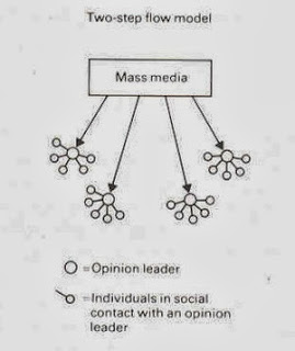 The Two-Step Flow Model, suggested by Lazarsfeld and Katz is a model that explains media consumption as individuals looking to opinion leaders to interpret the media for them.
The first step, as suggested by this graphic, is for the mass media to send out a message to the public. Opinion leaders pick up this media and they create and form their own opinions about the media. The next step is them transmitting this opinion and other people internalising it and making it their own viewpoint. An example of this would likely be the London Riots in the respect that people thought they ought to take part in them as many opinion leaders were stating on sites like Facebook and Twitter that they would be standing up to the police and making a statement. As a result many of these opinion leaders got in trouble, some for encouraging their friends to join in through BlackBerry Messenger.
An opinion leader could be a friend in a group, or it could be a celebrity. Many people have, for instance, donated to causes endorsed by celebrities. An example of this in recent times was Kony 2012, started by charity Invisible Children. The campaign was released to the mass media, spread on all manner of sites and many opinion leaders encouraged their friends and followers to support the campaign and encourage change, donating to the cause and paying money for fundraising packs and merchandise. Famous TV host Oprah Winfrey donated a massive $2million to the charity.
However, the individuals were not experiencing the media directly and they therefore missed out on several flaws in the campaign, such as the charity having offshore bank accounts and unfeasably high expenses, causing many opinion leaders to change their minds on the entire issue and try to rally against it, claiming that it was a complete set up and the charity was essentially just as bad as the man they were trying to stop.
Many of the individuals then picked up on this too - and the entire viral campaign was dropped and entirely forgotten about.
The Uses and Gratifications Theory, conceived by Katz, Blumler and Gurevitch, is a way of trying to understand why people actively seek out specific media outlets and content for gratification purposes. The theory discusses how users "proactively search for media that will not only meet a given need but enhance knowledge, social interactions and diversion."
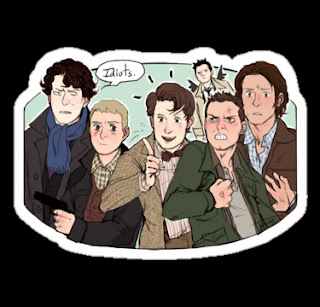 An example of this may be the 'Superwholock fandom' on micro-blogging site Tumblr. The idea encompasses three popular television shows - Supernatual, Doctor Who and Sherlock (BBC version). This is a strong example of the theory because it has formed a crossover between the three shows - therefore the audience is not passive, instead choosing to take an active role in interpreting the media and integrating the media into their own lives. For instance, Supernatural is a relatively dark TV show that contains a lot of sad themes and ones that may make some viewers uncomfortable. Many of the members of this 'fandom' have chosen instead to interpret the show in different ways, highlighting the funny and goofy moments and looking for subtexts. In this sense they are choosing media to meet their needs; they may prefer not to focus on the dark and unhappy elements of the show. The image to the right is an example of how some consumers may interpret the shows; they use the media to bring together their favourite characters, and in doing so they fulfill specific gratifications.
However, the model can also be used in a wider sense. The internet is a great example of how people may use the media to fulfill specific gratifications; they can seek out and use material however they would like to. The theory implies that the media competes against other information sources for the viewers gratification; which is likely true, when we look at how sites like Facebook and Twitter compete against other, more specialised forms of media. Facebook now has its own video services to help them compete with sites like Vine and even Instagram. They also allow their users to access these sites through applications on the website, encouraging users to stay on Facebook rather than straying elsewhere.
The Effects Model (Lotz) suggests that people react as a direct consequence to media exposure. It is known as the 'hypodermic needle model' as it implies that the media is being directly injected into the audience.
An example of a youth culture where this can be seen is the #BaldforBieber hashtag that briefly went around the internet last year. A few internet 'trolls' edited Wikipedia pages, created twitter accounts and made up some posts that implied that Justin Bieber himself was suffering from cancer and that many fans were shaving their heads in support of the star, to "help Justin through his illness".The rumours were quickly shut down, though not before images emerged online of a few fans who supposedly did actually shave their heads in support of their teen idol - who is not suffering from the illness.
The model also suggests that the viewing of media violence creates violence. In this vein, it is possible that Teddy Boys vandalised cinemas after viewing The Blackboard Jungle, and that feuds between the Mods and Rockers came from media portrayals as the two groups as opposites and therefore enemies. The increasing availability of material featuring violent imagery, such as films in cinemas and comic books is likely to have played a part in this, according to the Effects Model.
The same can be said for the London riots of 2011. The exposure that young people now have to media such as gruesome horror films, violent and immersive first person video games and music videos in which gang and riot culture is often depicted.
 The Two-Step Flow Model, suggested by Lazarsfeld and Katz is a model that explains media consumption as individuals looking to opinion leaders to interpret the media for them.
 The first step, as suggested by this graphic, is for the mass media to send out a message to the public. Opinion leaders pick up this media and they create and form their own opinions about the media. The next step is them transmitting this opinion and other people internalising it and making it their own viewpoint. An example of this would likely be the London Riots in the respect that people thought they ought to take part in them as many opinion leaders were stating on sites like Facebook and Twitter that they would be standing up to the police and making a statement. As a result many of these opinion leaders got in trouble, some for encouraging their friends to join in through BlackBerry Messenger.
An opinion leader could be a friend in a group, or it could be a celebrity. Many people have, for instance, donated to causes endorsed by celebrities. An example of this in recent times was Kony 2012, started by charity Invisible Children. The campaign was released to the mass media, spread on all manner of sites and many opinion leaders encouraged their friends and followers to support the campaign and encourage change, donating to the cause and paying money for fundraising packs and merchandise. Famous TV host Oprah Winfrey donated a massive $2million to the charity.
However, the individuals were not experiencing the media directly and they therefore missed out on several flaws in the campaign, such as the charity having offshore bank accounts and unfeasably high expenses, causing many opinion leaders to change their minds on the entire issue and try to rally against it, claiming that it was a complete set up and the charity was essentially just as bad as the man they were trying to stop.
Many of the individuals then picked up on this too - and the entire viral campaign was dropped and entirely forgotten about.
The Uses and Gratifications Theory, conceived by Katz, Blumler and Gurevitch, is a way of trying to understand why people actively seek out specific media outlets and content for gratification purposes. The theory discusses how users "proactively search for media that will not only meet a given need but enhance knowledge, social interactions and diversion."
 An example of this may be the 'Superwholock fandom' on micro-blogging site Tumblr. The idea encompasses three popular television shows - Supernatual, Doctor Who and Sherlock (BBC version). This is a strong example of the theory because it has formed a crossover between the three shows - therefore the audience is not passive, instead choosing to take an active role in interpreting the media and integrating the media into their own lives. For instance, Supernatural is a relatively dark TV show that contains a lot of sad themes and ones that may make some viewers uncomfortable. Many of the members of this 'fandom' have chosen instead to interpret the show in different ways, highlighting the funny and goofy moments and looking for subtexts. In this sense they are choosing media to meet their needs; they may prefer not to focus on the dark and unhappy elements of the show. The image to the right is an example of how some consumers may interpret the shows; they use the media to bring together their favourite characters, and in doing so they fulfill specific gratifications.
However, the model can also be used in a wider sense. The internet is a great example of how people may use the media to fulfill specific gratifications; they can seek out and use material however they would like to. The theory implies that the media competes against other information sources for the viewers gratification; which is likely true, when we look at how sites like Facebook and Twitter compete against other, more specialised forms of media. Facebook now has its own video services to help them compete with sites like Vine and even Instagram. They also allow their users to access these sites through applications on the website, encouraging users to stay on Facebook rather than straying elsewhere.
Tuesday, 22 October 2013
Storyboard
I have created a storyboard to depict visually what will be going on throughout my video; it includes some shot types, shot movements and the transitions between shots. I have also included where each shot will take place through a colour-coded key system, with a small coloured dot in the bottom right hand corner of each shot box.
Using this and the images, I will create an animatic storyboard to help me to understand how the music video may look in a quite loose, static manner.
Using this and the images, I will create an animatic storyboard to help me to understand how the music video may look in a quite loose, static manner.
Friday, 18 October 2013
Moral Panics
The 2013 'Heatwave'
In July 2013, temperatures began to rise above what is normally expected of Britain in the summer. We had very little rain and a lot of dry weather, leading the media to worry people.
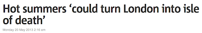 Reports started as far back as the 20th May, with one Metro article claiming that by 2080, hot summers would turn London into an 'island of death' due the concentrated nature of buildings creating unbearably hot conditions.
 However, throughout the majority of July, newspapers sensationalized the heat, turning it into something very scary; "500 could die as heatwave temperatures rocket to 33C" and warnings of forest fires sparked by the heatwave in Epping forest, with the North York moors facing "tinderbox conditions" due to the utter lack of precipitation. Tens of thousands of fish around the country also died, prompting sites such as the BBC News site to offer links to their audience to explain to them how to save ailing pond life.
As the heatwave settled in and people began to enjoy actually having a summer for once, Tesco raised the price of their own brand two-litre bottled still water from 18p to 24p, prompting outrage across news outlets, accusing the supermarket giant of "shameless profiteering" in the face of the heatwave.
There were many loose estimates made over the numbers of people who would perish throughout the month; "a hundred people could have died", "extreme heat sparks fears that hundreds of deaths are likely to occur", "the heatwave could have killed over 1000 people".
The Express personified the weather, branding it "humid, oppressive and uncomfortable". The news outlet also blamed the weather for rising numbers of divorce enquiries - "arguments heat up - as the temperatures rise so do divorce enquiries", as well as for the slowing down of house price growth.
This is an example of a moral panic, as detailed by Stan Cohen in his book "Folk Devils and Moral Panics". When in Clacton, he witnessed the infamous clashes between the Mods and Rockers, and noticed a difference between what he had seen with his own eyes and the stories published by the media.
A moral panic is a story or issue that is over-exaggerated by the media to make it seem to be a social problem and something that needs to be 'sorted out', prompting leagues of moral crusaders who claim that something needs to be done about the terror sweeping the country.
Tuesday, 15 October 2013
Schedule
I have created a schedule here that reflects the days that I will be filming. The ones labelled "potential for filming outside" reflect that I may be able to film on the beach, depending on when both myself and Max are working, and the weather on the day.
When it gets closer to the day of filming I will be able to give a more accurate, to the hour description of what will be going on but I am unaware of when I will have to work at the moment.

At the moment, the tide at Mundesley is highest at 4-5am and at its lowest at 11am-12pm. Therefore I will be looking to film between 10am and 12pm for the scenes on the beach.
Currently, the sun sets at around 5:50pm in Norwich at the moment. Therefore, I will be filming in Aylsham at between 4:30pm and 5:15pm; I do not want to film when it is too dark outside as I may then have some issues with lighting and being able to see the characters.
The Lafontaines' Digipaks

This is a mind map that I created, which looks at the existing cover artwork for The Lafontaines' releases, as well as mentioning some ideas that I have about what I could do for my own piece.
To view it in more detail, click on the picture to enlarge it.
Thursday, 10 October 2013
Magazine Advertisements
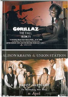 Conventions of a magazine advertisement for the release of a new album typically include the band's name, the title of the album, endorsements or taglines, the platform on which the album is released, the release date and some kind of specially created artwork that ties in nicely with the themes incorporated on the digipak and the music video. The adverts typically include the record label as well as an artist's website. Both of the adverts shown here have these features, despite being fairly different artists with different levels of success. Gorillaz are a well known group whereas Alison Krauss & Union Station are less of a commonly known artist. The artwork styles vary considerably too - whilst the artwork for 'The Fall' is much more cartoon-like and features concept art, in contrast to that for 'Paper Airplane', which has a much more realistic style with the sepia photograph. I think the covers are also reminiscent of the styles of music that they are advertising. The title track for 'Paper Airplane' is shot to have a very similar style of visual to the advert - as can be seen below. The way that the people are dressed in the advert is easy to relate to that in the video and to the style of music - the music is a mix of country/folk music and they are dressed in outfits that are related to this; with simple clothing and old style waistcoats and facial hair. The font of the advert can be linked to the music, as it is a serif, simple font that would be used when trying to represent 'old style'.
  In comparison, the advert for the Gorillaz reflects a far more modern style of music. One track from this album, titled Phoner To Arizona seems to suit the artwork well, with a very modern style of music, and soundbites in it that suit the cartoon on the advert (which looks dishevelled and a little creepy with the completely white eyes). The fonts for this advert are sans-serif and I like the way that there is contrast between the band's name and the rest of the font on the advert. This has turned the bands name into a logo almost, and makes it stand out in comparison to the rest of the text. I think this is helpful because there is contrast between the two, and the most important aspects of the advert are highlighted - the band name and the release date. However, this may only work for very popular bands - for instance, the loyal Gorillaz fan base would see the band's name and the date and know they want to buy the album.
  I think the one for Alison Krauss & Union Station's album is probably trying to create a band image - for one, they feature on it themselves, which is something a lot of music videos for new acts have. More popular and well established groups, like the Gorillaz, can afford to have concept artwork for their advert.
However this convention for music videos may not necessarily follow through to the adverts for the albums on which they feature. This magazine advert for the Foo Fighters 'Wasting Light' shows various members of the band, albeit in an abstract way. The Gorillaz advert shows a member of the band as they appear in their music videos, despite not actually being the real person singing/performing.
The fonts here are all similar. As this is a full page advert, the vertical nature allows for there to be a much more typical poster advertisement style - it looks as though it could be an advertisement for a film. The large typography of the band's name is good because of the way that it draws attention to them, and the very bright colours on the much darker background is very eye-catching.
Again there are some common themes - the website where you can buy the band's music, some credentials and logos including that of the record label.
The unusual graphic is quite eyecatching and once you see one face you're drawn in to looking at them all. In a way, it helps you to feel as though you're quite familiar with the band as you know their faces.
Digipak Planning - Cover
When I first started planning my digipak design, I had the idea of using a lightbulb in the same way that the Lafontaines' previous album artworks featured a shark's fin and blocks (see this post) because it carried a youthful feel to it.
I took to Microsoft Paint to have a play around to see how certain designs would look and to test out which fonts I liked.
I decided to use the font Droidiga as it was my favourite and on my kwiksurvey poll it was the most popular choice, other than Basic Title Font, which was not one that I wanted to use for the design I had decided to use - it seemed to light and I wanted a heavier font.
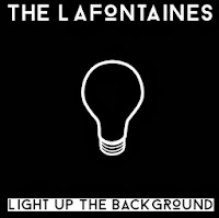 My first design was this: I found a simple outline for a lightbulb, something I had decided to look into using on the cover, and I inverted the colours so that it was going to fit the black background more.
I liked the contrast between the two titles, and I think it makes them each stand out respectively. The band's name stands out very clearly on a black background.
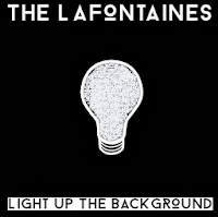 However, I thought this design was a little too simple and so I decided to change it a little bit. I used the exact same design, but this time I filled in the lightbulb. Due to having found the design online, the middle of the bulb would not fill completely due to areas being slightly different colours - on Microsoft Paint it only recognises one precise shade as the one you want to fill, so it came up with an interesting effect, as can be seen here. The scribbled look of the lightbulb reminds me slightly of the Mr Freeman aspect to my video as they are hand-drawn designs.
Whilst the design looks good from a distance, the colouring in looks tacky and like a design error. If I was to do a design like this for my cover, I might instead emulate the messy colouring in by doing it on a tablet or through scanning it into the computer.
My next few designs were changing certain aspects around, such as the band's name being in black and the title being in white, the background being white instead and the lightbulb being a multitude of colours.
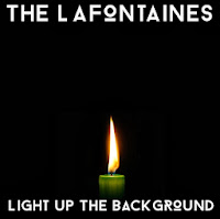 I then thought I would actually not have the title in black at the bottom, and make them both white over a black background. This seemed a lot cleaner and also a lot more attractive when I started to look at using photographs instead - mainly in order to add another dimension to the covers, which were looking quite flat and boring due to the fact there were only two shades of colour.
I found a photograph of a candle online. I am aware that I am not allowed to use any found images in my print production, but I am only using found images in my planning - I will draw or capture the images myself in the real product.
This cover felt a lot more like a real album cover to me, with the flame almost warming the space around it and making it look far less two-dimensional.
I would probably use a different coloured candle if I were to emulate this design in my print production, drawing on previous colour schemes that I've found in their previous products - such as blue, red, coral or grey.
However, my concern here was that the candle was a little too religious for my liking - it looked almost too controlled and reminded me of a vigil - the title track is not fitting to this and I didn't want the cover to be misleading to an audience. This is likely due to the colour of the candle itself but also because of the symbolism of a flame shown in this way.
I then looked to other sources of light (I made the decision to draw on the first word of the title for an image as their single 'Shark In The Water' has a shark's fin on, almost like a dingbat - so I wanted it to be quite literal), and decided to look into how a lighter may look - I want to use this icon in my music video anyway, so it seemed appropriate to use it as a graphic on the title.
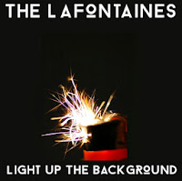 Here, the background colour has changed a little - it is slightly more green than the previous ones. However, I like this as it yet again adds a little more depth and variety to the cover. This is a found image as well - I would look into emulating this in my own cover. This image is appropriate to the song in my eyes as it is suggesting a little rebellion and the spark of something; perhaps the spark that sets something big off. It is a much more exciting image in terms of the semiology attached to it and creates somewhat of a sense of danger. However, the colours of this picture also give off a sense of fun, too (the pinks and purples amongst the orange and white spark)
 I like this design the most out of the ones I have shown on this post. I think it has quite a lot of depth of tone and the picture is interesting to look at.
The design reminds me somewhat of the cover for Bastille's Bad Blood - this is likely due to the font having unusual letters - like the 'o' is different to how it looks in most typefaces, akin to the unusual 'a' in Bad Blood.
 I also decided to do a mock-up of a back cover too. I followed through with the theme from the front - sparks and light, and then found an image which I felt looked good when I put the track listing over it.
I preferred the look of the text being inside a black box because not only did it help the letters to stand out against the image, but it also gave it quite a modern feel - and since they are a modern band I felt this was important.
I took to Microsoft Paint to have a play around to see how certain designs would look and to test out which fonts I liked.
I decided to use the font Droidiga as it was my favourite and on my kwiksurvey poll it was the most popular choice, other than Basic Title Font, which was not one that I wanted to use for the design I had decided to use - it seemed to light and I wanted a heavier font.
 My first design was this: I found a simple outline for a lightbulb, something I had decided to look into using on the cover, and I inverted the colours so that it was going to fit the black background more.
 I liked the contrast between the two titles, and I think it makes them each stand out respectively. The band's name stands out very clearly on a black background.
 However, I thought this design was a little too simple and so I decided to change it a little bit. I used the exact same design, but this time I filled in the lightbulb. Due to having found the design online, the middle of the bulb would not fill completely due to areas being slightly different colours - on Microsoft Paint it only recognises one precise shade as the one you want to fill, so it came up with an interesting effect, as can be seen here. The scribbled look of the lightbulb reminds me slightly of the Mr Freeman aspect to my video as they are hand-drawn designs.
Whilst the design looks good from a distance, the colouring in looks tacky and like a design error. If I was to do a design like this for my cover, I might instead emulate the messy colouring in by doing it on a tablet or through scanning it into the computer.
My next few designs were changing certain aspects around, such as the band's name being in black and the title being in white, the background being white instead and the lightbulb being a multitude of colours.
 I then thought I would actually not have the title in black at the bottom, and make them both white over a black background. This seemed a lot cleaner and also a lot more attractive when I started to look at using photographs instead - mainly in order to add another dimension to the covers, which were looking quite flat and boring due to the fact there were only two shades of colour.
 I found a photograph of a candle online. I am aware that I am not allowed to use any found images in my print production, but I am only using found images in my planning - I will draw or capture the images myself in the real product.
This cover felt a lot more like a real album cover to me, with the flame almost warming the space around it and making it look far less two-dimensional.
I would probably use a different coloured candle if I were to emulate this design in my print production, drawing on previous colour schemes that I've found in their previous products - such as blue, red, coral or grey.
However, my concern here was that the candle was a little too religious for my liking - it looked almost too controlled and reminded me of a vigil - the title track is not fitting to this and I didn't want the cover to be misleading to an audience. This is likely due to the colour of the candle itself but also because of the symbolism of a flame shown in this way.
I then looked to other sources of light (I made the decision to draw on the first word of the title for an image as their single 'Shark In The Water' has a shark's fin on, almost like a dingbat - so I wanted it to be quite literal), and decided to look into how a lighter may look - I want to use this icon in my music video anyway, so it seemed appropriate to use it as a graphic on the title.
 Here, the background colour has changed a little - it is slightly more green than the previous ones. However, I like this as it yet again adds a little more depth and variety to the cover. This is a found image as well - I would look into emulating this in my own cover. This image is appropriate to the song in my eyes as it is suggesting a little rebellion and the spark of something; perhaps the spark that sets something big off. It is a much more exciting image in terms of the semiology attached to it and creates somewhat of a sense of danger. However, the colours of this picture also give off a sense of fun, too (the pinks and purples amongst the orange and white spark)
 I like this design the most out of the ones I have shown on this post. I think it has quite a lot of depth of tone and the picture is interesting to look at.
The design reminds me somewhat of the cover for Bastille's Bad Blood - this is likely due to the font having unusual letters - like the 'o' is different to how it looks in most typefaces, akin to the unusual 'a' in Bad Blood.

I preferred the look of the text being inside a black box because not only did it help the letters to stand out against the image, but it also gave it quite a modern feel - and since they are a modern band I felt this was important.
Wednesday, 9 October 2013
 0%
0%
Subscribe to:
Comments (Atom)