
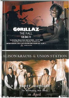
 Conventions of a magazine advertisement for the release of a new album typically include the band's name, the title of the album, endorsements or taglines, the platform on which the album is released, the release date and some kind of specially created artwork that ties in nicely with the themes incorporated on the digipak and the music video. The adverts typically include the record label as well as an artist's website. Both of the adverts shown here have these features, despite being fairly different artists with different levels of success. Gorillaz are a well known group whereas Alison Krauss & Union Station are less of a commonly known artist. The artwork styles vary considerably too - whilst the artwork for 'The Fall' is much more cartoon-like and features concept art, in contrast to that for 'Paper Airplane', which has a much more realistic style with the sepia photograph. I think the covers are also reminiscent of the styles of music that they are advertising. The title track for 'Paper Airplane' is shot to have a very similar style of visual to the advert - as can be seen below. The way that the people are dressed in the advert is easy to relate to that in the video and to the style of music - the music is a mix of country/folk music and they are dressed in outfits that are related to this; with simple clothing and old style waistcoats and facial hair. The font of the advert can be linked to the music, as it is a serif, simple font that would be used when trying to represent 'old style'.
  In comparison, the advert for the Gorillaz reflects a far more modern style of music. One track from this album, titled Phoner To Arizona seems to suit the artwork well, with a very modern style of music, and soundbites in it that suit the cartoon on the advert (which looks dishevelled and a little creepy with the completely white eyes). The fonts for this advert are sans-serif and I like the way that there is contrast between the band's name and the rest of the font on the advert. This has turned the bands name into a logo almost, and makes it stand out in comparison to the rest of the text. I think this is helpful because there is contrast between the two, and the most important aspects of the advert are highlighted - the band name and the release date. However, this may only work for very popular bands - for instance, the loyal Gorillaz fan base would see the band's name and the date and know they want to buy the album.
  I think the one for Alison Krauss & Union Station's album is probably trying to create a band image - for one, they feature on it themselves, which is something a lot of music videos for new acts have. More popular and well established groups, like the Gorillaz, can afford to have concept artwork for their advert.
However this convention for music videos may not necessarily follow through to the adverts for the albums on which they feature. This magazine advert for the Foo Fighters 'Wasting Light' shows various members of the band, albeit in an abstract way. The Gorillaz advert shows a member of the band as they appear in their music videos, despite not actually being the real person singing/performing.
The fonts here are all similar. As this is a full page advert, the vertical nature allows for there to be a much more typical poster advertisement style - it looks as though it could be an advertisement for a film. The large typography of the band's name is good because of the way that it draws attention to them, and the very bright colours on the much darker background is very eye-catching.
Again there are some common themes - the website where you can buy the band's music, some credentials and logos including that of the record label.
The unusual graphic is quite eyecatching and once you see one face you're drawn in to looking at them all. In a way, it helps you to feel as though you're quite familiar with the band as you know their faces.
No comments:
Post a Comment