Chloe Ward, Reepham High School and College (18333), 3219

Friday 25 October 2013

The Selfish Giant

Clio Barnard is a British director and the director of films such as The Arbor and The Selfish Giant, an adapted version of Oscar Wilde's classic story.
In an article with theskinny.co.uk, Barnard explained her inspiration behind the adaptation; it is her young son's favourite bedtime story.
She states that when filming The Arbor, she "saw loads of children that are excluded, not just from school, but from society. And then they’re demonised." 
Cinevue claimed that "British social realism gets a welcome shot in the arm" with the release of the movie at the Cannes film festival. 
The film is a "a contemporary coming of age fable about two young Yorkshire lads from a deprived estate who are drawn into the murkier side of scrap metal dealing.  The lure of cash is tempting but it’s an arrangement that tests the boys’ friendship to the limit and, ultimately, brings about heart breaking tragedy" according to Filmoria, who rated the film very highly, giving it 4.5/5 stars for direction and performance. 

Shot List


I have created a shot list for my video to help me on the day; this will predominantly help me to organise my shots. I have kept it on an excel document and this will be useful in the shooting of the film.
I have also uploaded it to my google Drive, so that I can access it on my tablet on the move.

Filming Schedule

Max and I have worked out one definite day where we are both available for at least a few uninterrupted hours.
Tuesday 29th October is the day that we have decided to film on.
He is away from the 30th to the 31st of October so we will not be able to film during this period. I don't know if I will be entirely free on the 1st of November, but I am confident that there will be some time in the day to finish up any filming that either hasn't gone too well or any clips that we couldn't do (weather may have limited our outdoor scenes, for example).

Animatic Storyboard: Light Up The Background


I decided to create an animatic storyboard for my music video, using the sketches I drew for my regular storyboard, but setting them to music instead.
This also contains the proper version of the song, as can be found on their EP, which is of higher quality than the versions I have used in my storyboard of ideas and other media.

Thursday 24 October 2013

Media Effects Models

Media effects models are effectively theories which help to explain how people internalise the media that they consume. They are important as they allow us to think about the effect that media has on these youth cultures, as well as the effect of reporting youth cultures through media outlets.

The Effects Model (Lotz) suggests that people react as a direct consequence to media exposure. It is known as the 'hypodermic needle model' as it implies that the media is being directly injected into the audience.
#BaldForBieber cancer hoax Justin Bieber trolls Beliebers fans Reddit 4chanAn example of a youth culture where this can be seen is the #BaldforBieber hashtag that briefly went around the internet last year. A few internet 'trolls' edited Wikipedia pages, created twitter accounts and made up some posts that implied that Justin Bieber himself was suffering from cancer and that many fans were shaving their heads in support of the star, to "help Justin through his illness".
The rumours were quickly shut down, though not before images emerged online of a few fans who supposedly did actually shave their heads in support of their teen idol - who is not suffering from the illness.

The model also suggests that the viewing of media violence creates violence. In this vein, it is possible that Teddy Boys vandalised cinemas after viewing The Blackboard Jungle, and that feuds between the Mods and Rockers came from media portrayals as the two groups as opposites and therefore enemies. The increasing availability of material featuring violent imagery, such as films in cinemas and comic books is likely to have played a part in this, according to the Effects Model.
The same can be said for the London riots of 2011. The exposure that young people now have to media such as gruesome horror films, violent and immersive first person video games and music videos in which gang and riot culture is often depicted.

The Two-Step Flow Model, suggested by Lazarsfeld and Katz is a model that explains media consumption as individuals looking to opinion leaders to interpret the media for them.
The first step, as suggested by this graphic, is for the mass media to send out a message to the public. Opinion leaders pick up this media and they create and form their own opinions about the media. The next step is them transmitting this opinion and other people internalising it and making it their own viewpoint. An example of this would likely be the London Riots in the respect that people thought they ought to take part in them as many opinion leaders were stating on sites like Facebook and Twitter that they would be standing up to the police and making a statement. As a result many of these opinion leaders got in trouble, some for encouraging their friends to join in through BlackBerry Messenger.
An opinion leader could be a friend in a group, or it could be a celebrity. Many people have, for instance, donated to causes endorsed by celebrities. An example of this in recent times was Kony 2012, started by charity Invisible Children. The campaign was released to the mass media, spread on all manner of sites and many opinion leaders encouraged their friends and followers to support the campaign and encourage change, donating to the cause and paying money for fundraising packs and merchandise. Famous TV host Oprah Winfrey donated a massive $2million to the charity.
However, the individuals were not experiencing the media directly and they therefore missed out on several flaws in the campaign, such as the charity having offshore bank accounts and unfeasably high expenses, causing many opinion leaders to change their minds on the entire issue and try to rally against it, claiming that it was a complete set up and the charity was essentially just as bad as the man they were trying to stop.
Many of the individuals then picked up on this too - and the entire viral campaign was dropped and entirely forgotten about.

The Uses and Gratifications Theory, conceived by Katz, Blumler and Gurevitch, is a way of trying to understand why people actively seek out specific media outlets and content for gratification purposes. The theory discusses how users "proactively search for media that will not only meet a given need but enhance knowledge, social interactions and diversion."
An example of this may be the 'Superwholock fandom' on micro-blogging site Tumblr. The idea encompasses three popular television shows - Supernatual, Doctor Who and Sherlock (BBC version). This is a strong example of the theory because it has formed a crossover between the three shows - therefore the audience is not passive, instead choosing to take an active role in interpreting the media and integrating the media into their own lives. For instance, Supernatural is a relatively dark TV show that contains a lot of sad themes and ones that may make some viewers uncomfortable. Many of the members of this 'fandom' have chosen instead to interpret the show in different ways, highlighting the funny and goofy moments and looking for subtexts. In this sense they are choosing media to meet their needs; they may prefer not to focus on the dark and unhappy elements of the show. The image to the right is an example of how some consumers may interpret the shows; they use the media to bring together their favourite characters, and in doing so they fulfill specific gratifications.
However, the model can also be used in a wider sense. The internet is a great example of how people may use the media to fulfill specific gratifications; they can seek out and use material however they would like to. The theory implies that the media competes against other information sources for the viewers gratification; which is likely true, when we look at how sites like Facebook and Twitter compete against other, more specialised forms of media. Facebook now has its own video services to help them compete with sites like Vine and even Instagram. They also allow their users to access these sites through applications on the website, encouraging users to stay on Facebook rather than straying elsewhere.

Tuesday 22 October 2013

Storyboard

I have created a storyboard to depict visually what will be going on throughout my video; it includes some shot types, shot movements and the transitions between shots. I have also included where each shot will take place through a colour-coded key system, with a small coloured dot in the bottom right hand corner of each shot box.


Using this and the images, I will create an animatic storyboard to help me to understand how the music video may look in a quite loose, static manner.

Friday 18 October 2013

Moral Panics

The 2013 'Heatwave'
In July 2013, temperatures began to rise above what is normally expected of Britain in the summer. We had very little rain and a lot of dry weather, leading the media to worry people.
Reports started as far back as the 20th May, with one Metro article claiming that by 2080, hot summers would turn London into an 'island of death' due the concentrated nature of buildings creating unbearably hot conditions.
However, throughout the majority of July, newspapers sensationalized the heat, turning it into something very scary; "500 could die as heatwave temperatures rocket to 33C" and warnings of forest fires sparked by the heatwave in Epping forest, with the North York moors facing "tinderbox conditions" due to the utter lack of precipitation. Tens of thousands of fish around the country also died, prompting sites such as the BBC News site to offer links to their audience to explain to them how to save ailing pond life.
As the heatwave settled in and people began to enjoy actually having a summer for once, Tesco raised the price of their own brand two-litre bottled still water from 18p to 24p, prompting outrage across news outlets, accusing the supermarket giant of "shameless profiteering" in the face of the heatwave.
There were many loose estimates made over the numbers of people who would perish throughout the month; "a hundred people could have died", "extreme heat sparks fears that hundreds of deaths are likely to occur", "the heatwave could have killed over 1000 people".
The Express personified the weather, branding it "humid, oppressive and uncomfortable". The news outlet also blamed the weather for rising numbers of divorce enquiries - "arguments heat up - as the temperatures rise so do divorce enquiries", as well as for the slowing down of house price growth.

This is an example of a moral panic, as detailed by Stan Cohen in his book "Folk Devils and Moral Panics". When in Clacton, he witnessed the infamous clashes between the Mods and Rockers, and noticed a difference between what he had seen with his own eyes and the stories published by the media.
A moral panic is a story or issue that is over-exaggerated by the media to make it seem to be a social problem and something that needs to be 'sorted out', prompting leagues of moral crusaders who claim that something needs to be done about the terror sweeping the country.

Tuesday 15 October 2013

Schedule

I have created a schedule here that reflects the days that I will be filming. The ones labelled "potential for filming outside" reflect that I may be able to film on the beach, depending on when both myself and Max are working, and the weather on the day.
When it gets closer to the day of filming I will be able to give a more accurate, to the hour description of what will be going on but I am unaware of when I will have to work at the moment.


At the moment, the tide at Mundesley is highest at 4-5am and at its lowest at 11am-12pm. Therefore I will be looking to film between 10am and 12pm for the scenes on the beach.
Currently, the sun sets at around 5:50pm in Norwich at the moment. Therefore, I will be filming in Aylsham at between 4:30pm and 5:15pm; I do not want to film when it is too dark outside as I may then have some issues with lighting and being able to see the characters.

How are youth cultures represented in Quadrophenia?


The Lafontaines' Digipaks


This is a mind map that I created, which looks at the existing cover artwork for The Lafontaines' releases, as well as mentioning some ideas that I have about what I could do for my own piece.

To view it in more detail, click on the picture to enlarge it.

Thursday 10 October 2013

Magazine Advertisements

Conventions of a magazine advertisement for the release of a new album typically include the band's name, the title of the album, endorsements or taglines, the platform on which the album is released, the release date and some kind of specially created artwork that ties in nicely with the themes incorporated on the digipak and the music video. The adverts typically include the record label as well as an artist's website. Both of the adverts shown here have these features, despite being fairly different artists with different levels of success. Gorillaz are a well known group whereas Alison Krauss & Union Station are less of a commonly known artist. The artwork styles vary considerably too - whilst the artwork for 'The Fall' is much more cartoon-like and features concept art, in contrast to that for 'Paper Airplane', which has a much more realistic style with the sepia photograph. I think the covers are also reminiscent of the styles of music that they are advertising. The title track for 'Paper Airplane' is shot to have a very similar style of visual to the advert - as can be seen below. The way that the people are dressed in the advert is easy to relate to that in the video and to the style of music - the music is a mix of country/folk music and they are dressed in outfits that are related to this; with simple clothing and old style waistcoats and facial hair. The font of the advert can be linked to the music, as it is a serif, simple font that would be used when trying to represent 'old style'. 
In comparison, the advert for the Gorillaz reflects a far more modern style of music. One track from this album, titled Phoner To Arizona seems to suit the artwork well, with a very modern style of music, and soundbites in it that suit the cartoon on the advert (which looks dishevelled and a little creepy with the completely white eyes). The fonts for this advert are sans-serif and I like the way that there is contrast between the band's name and the rest of the font on the advert. This has turned the bands name into a logo almost, and makes it stand out in comparison to the rest of the text. I think this is helpful because there is contrast between the two, and the most important aspects of the advert are highlighted - the band name and the release date. However, this may only work for very popular bands - for instance, the loyal Gorillaz fan base would see the band's name and the date and know they want to buy the album. 
I think the one for Alison Krauss & Union Station's album is probably trying to create a band image - for one, they feature on it themselves, which is something a lot of music videos for new acts have. More  popular and well established groups, like the Gorillaz, can afford to have concept artwork for their advert.
However this convention for music videos may not necessarily follow through to the adverts for the albums on which they feature. This magazine advert for the Foo Fighters 'Wasting Light' shows various members of the band, albeit in an abstract way. The Gorillaz advert shows a member of the band as they appear in their music videos, despite not actually being the real person singing/performing.
The fonts here are all similar. As this is a full page advert, the vertical nature allows for there to be a much more typical poster advertisement style - it looks as though it could be an advertisement for a film. The large typography of the band's name is good because of the way that it draws attention to them, and the very bright colours on the much darker background is very eye-catching.
Again there are some common themes - the website where you can buy the band's music, some credentials and logos including that of the record label.
The unusual graphic is quite eyecatching and once you see one face you're drawn in to looking at them all. In a way, it helps you to feel as though you're quite familiar with the band as you know their faces.

Digipak Planning - Cover

When I first started planning my digipak design, I had the idea of using a lightbulb in the same way that the Lafontaines' previous album artworks featured a shark's fin and blocks (see this post) because it carried a youthful feel to it.
I took to Microsoft Paint to have a play around to see how certain designs would look and to test out which fonts I liked.
I decided to use the font Droidiga as it was my favourite and on my kwiksurvey poll it was the most popular choice, other than Basic Title Font, which was not one that I wanted to use for the design I had decided to use - it seemed to light and I wanted a heavier font.
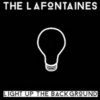
My first design was this: I found a simple outline for a lightbulb, something I had decided to look into using on the cover, and I inverted the colours so that it was going to fit the black background more.
I liked the contrast between the two titles, and I think it makes them each stand out respectively. The band's name stands out very clearly on a black background.
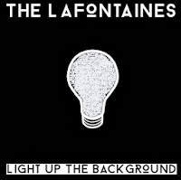
However, I thought this design was a little too simple and so I decided to change it a little bit. I used the exact same design, but this time I filled in the lightbulb. Due to having found the design online, the middle of the bulb would not fill completely due to areas being slightly different colours - on Microsoft Paint it only recognises one precise shade as the one you want to fill, so it came up with an interesting effect, as can be seen here. The scribbled look of the lightbulb reminds me slightly of the Mr Freeman aspect to my video as they are hand-drawn designs.
Whilst the design looks good from a distance, the colouring in looks tacky and like a design error. If I was to do a design like this for my cover, I might instead emulate the messy colouring in by doing it on a tablet or through scanning it into the computer.
My next few designs were changing certain aspects around, such as the band's name being in black and the title being in white, the background being white instead and the lightbulb being a multitude of colours.
I then thought I would actually not have the title in black at the bottom, and make them both white over a black background. This seemed a lot cleaner and also a lot more attractive when I started to look at using photographs instead - mainly in order to add another dimension to the covers, which were looking quite flat and boring due to the fact there were only two shades of colour.
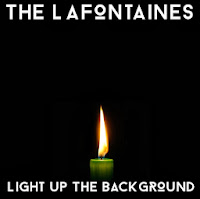
I found a photograph of a candle online. I am aware that I am not allowed to use any found images in my print production, but I am only using found images in my planning - I will draw or capture the images myself in the real product.
This cover felt a lot more like a real album cover to me, with the flame almost warming the space around it and making it look far less two-dimensional.
I would probably use a different coloured candle if I were to emulate this design in my print production, drawing on previous colour schemes that I've found in their previous products - such as blue, red, coral or grey.
However, my concern here was that the candle was a little too religious for my liking - it looked almost too controlled and reminded me of a vigil - the title track is not fitting to this and I didn't want the cover to be misleading to an audience. This is likely due to the colour of the candle itself but also because of the symbolism of a flame shown in this way.
I then looked to other sources of light (I made the decision to draw on the first word of the title for an image as their single 'Shark In The Water' has a shark's fin on, almost like a dingbat - so I wanted it to be quite literal), and decided to look into how a lighter may look - I want to use this icon in my music video anyway, so it seemed appropriate to use it as a graphic on the title.
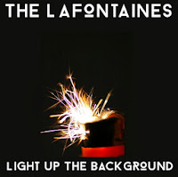
Here, the background colour has changed a little - it is slightly more green than the previous ones. However, I like this as it yet again adds a little more depth and variety to the cover. This is a found image as well - I would look into emulating this in my own cover. This image is appropriate to the song in my eyes as it is suggesting a little rebellion and the spark of something; perhaps the spark that sets something big off. It is a much more exciting image in terms of the semiology attached to it and creates somewhat of a sense of danger. However, the colours of this picture also give off a sense of fun, too (the pinks and purples amongst the orange and white spark)
I like this design the most out of the ones I have shown on this post. I think it has quite a lot of depth of tone and the picture is interesting to look at.
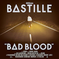
The design reminds me somewhat of the cover for Bastille's Bad Blood - this is likely due to the font having unusual letters - like the 'o' is different to how it looks in most typefaces, akin to the unusual 'a' in Bad Blood.
I also decided to do a mock-up of a back cover too. I followed through with the theme from the front - sparks and light, and then found an image which I felt looked good when I put the track listing over it.
I preferred the look of the text being inside a black box because not only did it help the letters to stand out against the image, but it also gave it quite a modern feel - and since they are a modern band I felt this was important.

Wednesday 9 October 2013

Poll (Please Respond!)


Which of the following fonts do you prefer?

Basic Title Font0%
Bebas Neue0%
Droidiga0%
Guilder0%
Homizio0%
Ostrich Sans Inline0%
Revolution0%

Tuesday 8 October 2013

Props

I have recently purchased a pair of metal handcuffs for use in my video - I will be using these for a brief shot and hence I have not purchased anything too expensive.

The remainder of the props will all be provided by cast members - such as Max's clothes, his bmx equipment, and things such as the cigarettes can be provided by my friend.

Wednesday 2 October 2013

Teddy Boys News Coverage

This article from Brighton's Evening Argus - 1954 has a lot of interesting things to say about the Teddy Boys. The authoress, Mrs Ruby Starr, calls the Teddy Boys 'silly little self advertising nincompoops', showing how disdainful she feels at their presence in her town. She clearly feels that their actions (the way they are dressing and their social activities) are being put on for attention from the press. She calls them 'nincompoops', attacking their intellectual ability and therefore suggesting that it is people who are not clever who join these subcultures.
She also refers to them as 'nauseating', claiming that they make people feel physically ill when they encounter the Teddy Boys. This is followed up by them being referred to as 'specimens',  which brings to mind thoughts of a lab experiment. This takes away their humanity as they are being referred to as something kept in a jar in a lab, such as a frog or blood slide. It suggests that, like a lab experiment, the Teddy Boys ought to be looked at and closely examined from afar, in the interests of safety.
She believes that local authorities ought to 'remove' them, as though the subculture is a piece of graffiti or something else unpleasant that has been left on the streets. It is a very clinical term and shows just how detached and uncaring Mrs Starr feels towards the Teddy Boys.

Another article, from the Sunday Chronicle two weeks before is titled "Gangs Menace Report". This opens with the words '"Edwardian" spivs'. The word 'spiv' looks and seems to be similar to the more modern word 'chav', and is certainly being used as a derogatory term or slur.
The article claims that Brighton and Hove has been 'terrorised' by the Teddy Boys. This suggests that they are something that causes absolute terror, not just fear amongst the general population. They are portrayed as being worse than monsters almost, which is a big label to have placed on a person.
The article then mentions the police having to 'cope' with the threatened 'invasion' of the Teddy Boys. It seems to be inferring that the Teddy Boys coming to Brighton and Hove carries a big threat with emotional implications, and the use of the word 'invasion' shows that the subculture is going somewhere they aren't supposed to be going and that they are some kind of alien to the area - again, something scary and not something about which people have much knowledge (potentially why they feel so threatened and terrorised in the first place.)
The article talks about 'savage battles', suggesting that they are wild and uncontrollable. The word 'savage' suggests that they weren't raised properly and have a wild side, causing them to be violent and brutal in their actions.
The clothing worn by the Teddy Boys is referred to as a 'thugs uniform', bringing to mind thoughts of premediated and organised crime, akin to how the mafia is seen to wear sharp suits. It reinforces the idea of being a Teddy Boy as having an identity and a role. They are seen as being more of a serious subculture if they have a dress code.
The article claims that local business people 'dread their arrival', suggesting that the Teddy Boy's visit often and cause trouble every single time.