
Tuesday 24 September 2013
Monday 23 September 2013
Teddy Boys

A group known as ‘Teddy Boys’ or ‘Edwardians’ became
prevalent in the early 1950s in the South and West areas of London. They were a
‘dandified’ street gang – they dressed extravagantly and posed defiantly, making
them popular subjects for the growing media and television industry of 1950s
Britain. They became a media folk devil; the media vilified them and spread their
image so that soon, the Teddy Boy was a nationwide teenage style and the first
post war subculture, going beyond the original metropolitan gangs.
Despite being inner-city working class youth, they wore
expensive Edwardian ‘Ted’ suits designed for wealthy city gentlemen in the
early 1950s, or the ‘drape’ jackets favoured by the growing number of rock and
roll stars in the USA. One magazine
carried the following headline: Teenage
Terrorists – Absurd but Deadly, in 1954.
The Teddy Boy image sent a powerful message; the wearing of
upper class clothes by working class youths was an incredibly defiant act. This
exaggerated way of dressing made them an easy target for the media; they were
constantly teased and discredited for wearing such nice clothes. Ridiculed
often, a caricature of a Teddy Boy as a ‘monkey in a drape’ was printed in the
Brighton Evening Argus in 1954. This clearly portrays how the general public perceived
them at this time.
Friday 20 September 2013
Trial - Saturation and Speed
In this video, I took a clip of someone licking the edge of roll up cigarette. I edited it in iMovie and then edited it several times, varying the speed and saturation each time.
I decided that 25% saturation looked best. 0% saturation seemed too dark to me. Having it so dark meant that it might not fit in well with other clips, which I don't necessarily think need to be so gloomy. It was dark enough to suggest a negative emotion without being completely unhappy and dark. I will probably use 60% speed too - it is not completely slowed down but gives the dreamy effect I think would look good.
Tuesday 17 September 2013
Digipak Analysis - What The Night Delivers - Scott Matthews

This is an analysis of the digipak of What The Night Delivers by Scott Matthews. If you click on the images they will enlarge so they can be read.

Prop List
Prop list from Chloewardmediablog
This is a detailed look at the props that I'll be using in my video - both clothing and other objects.
This is a detailed look at the props that I'll be using in my video - both clothing and other objects.
Light Up The Background - A Storyboard of Ideas
This is a very basic, first draft of the kinds of things I am hoping to include in my music video.
Friday 13 September 2013
The Blackout - Higher and Higher
I chose to look at this video because it has shots of parkour throughout. Since these action shots are something I could include in my own video, I thought it would be interesting to look at them.


These three shots are shown here in sequence. I like the way that you see the man preparing for the stunt, jumping onto the car bonnet, moving into it and the change to the shot of him doing the front flip. It then goes back to where we see him land, which I think emphasizes the fact that he has done a technically proficient stunt.
There are also some shots where his actions are shown in slow motion. This again shows the skill off to a higher degree, as we get to see him for a longer period of time, as well as the trick itself in a lot more detail. I think this would be a good tool to use in my own video when looking at Max BMX-ing.
Locations
In my video, I will use a variety of locations, as this will be reflective of the fact that the character is an active, sociable teenager.
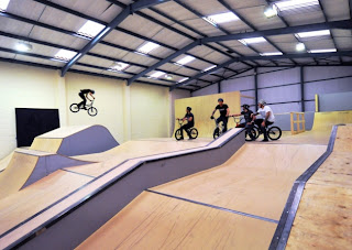
 I will definitely be filming at a skate park at some point. If I film it outside, I will use North Walsham Skate Park (see left). It has a lot of spaces where I could stand in order to get good shots. However, I have to be realistic with timing and also the weather at that time of year - in late October, it will get dark early, and may rain. I have to be considerate of the time of day too, as the sun may cast shadows in places I don't want them to be.
 I could also film it at the skate park in Aylsham. This is a smaller park, however, with smaller ramps and hence the shots might not be as interesting. There are less trees around it though, which might be beneficial as it's less likely my shots will be obscured by any shadows from that.
Another possible location for shooting Max on his BMX is to use the Charge Unit in Norwich. It is an indoor skating location, and Max is friendly with the owners and works there on occasion. It is probably a better location in the sense that I will be able to get lots of good shots of him with constant light - from the floodlights above. If I film it in an indoors location then I can use the higher quality cameras too.
In terms of the shots that won't be including any BMX-ing, I will be shooting around Aylsham.
 This shot shows Burgh Road in Aylsham, which is a dimly lit and fairly clear in the evenings. I think it will be an interesting setting and as the road only bends off slightly I think I may be able to have images of Max running down the road.
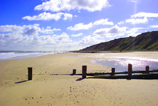 I also am contemplating using a beach in my video, especially in the intro, to help contrast the good things associated with the line "we're not alone in this cold town, light up the background, light up the background", to the negative things experienced in the chorus.
I decided that I would film a fairly small part of the video on a beach; I will use Mundesley beach in particular because it is fairly close to my house and a location I know quite well. I will use a less commercial part of the beach as there should therefore be less people around (even though it will already be quieter than average due to the time of year). The shots here will be quite short and I won't take many since this is a relatively small aspect of the video.

 I could also film it at the skate park in Aylsham. This is a smaller park, however, with smaller ramps and hence the shots might not be as interesting. There are less trees around it though, which might be beneficial as it's less likely my shots will be obscured by any shadows from that.
Another possible location for shooting Max on his BMX is to use the Charge Unit in Norwich. It is an indoor skating location, and Max is friendly with the owners and works there on occasion. It is probably a better location in the sense that I will be able to get lots of good shots of him with constant light - from the floodlights above. If I film it in an indoors location then I can use the higher quality cameras too.
In terms of the shots that won't be including any BMX-ing, I will be shooting around Aylsham.

 I also am contemplating using a beach in my video, especially in the intro, to help contrast the good things associated with the line "we're not alone in this cold town, light up the background, light up the background", to the negative things experienced in the chorus.
I decided that I would film a fairly small part of the video on a beach; I will use Mundesley beach in particular because it is fairly close to my house and a location I know quite well. I will use a less commercial part of the beach as there should therefore be less people around (even though it will already be quieter than average due to the time of year). The shots here will be quite short and I won't take many since this is a relatively small aspect of the video.
Tuesday 10 September 2013
My Actor - Max Ward
The main character in my music video will be a 16 year old boy, who is facing pressures faced by many people of his age.
 I will be using my younger brother Max, who is pictured here. He likes BMX-ing and hence I will be including some of this in the video.
 I will probably use this location in the video. It is a relatively light location which might translate to black and white quite well. The screen will likely show the Mr Freeman video.
I feel that Max is a good actor to use in my video because he is fairly average in his way of dress and in his looks; there is nothing overly distinctive about him and therefore he will be a fair representation of young men. He also looks slightly older than 16 in my opinion, which might be helpful.
My audience research revealed that the predominant audience for The LaFontaines was female, and aged around 17/18. It also revealed that people enjoy watching the band's videos because of the fact that lead vocalist Kerr Okan appears so heavily in it. I have been unable to replicate this in my own video, but I think having an 'attractive' male character in the video will help to draw in attention from the female audience.
"Light Up The Background" Mind Map

Friday 6 September 2013
G325: Youth Culture - Bowery Boys
The Bowery Boys were an anti-Catholic, anti-Irish gang based north of New York City in the mid-19th Century.
 They most likely had similar values and norms, which is why they likely identified together in the first place.
They were described by the media as a 'gang', rather than a group. This term has come to be used in a negative way and is now associated with violence, crime and threatening behaviour.
They were mostly single males who frequented salons and brothels of the area known as the Bowery and dressed in black stovepipe hats, red shirts, black flared trousers, high heeled calfskin boots and black vests. Their hair was oil-slicked and subsequently they were referred to as "Soaplocks" - a 'colo
urful' label as described by Kettley. This can be seen to have led to discrimination against them as terms associated with negative things (such as the Bowery Boys' violence) can become a derogatory and inflammatory term.
urful' label as described by Kettley. This can be seen to have led to discrimination against them as terms associated with negative things (such as the Bowery Boys' violence) can become a derogatory and inflammatory term.
They conform to the criteria that can be applied to many youth cultures today. The members of the group share similar cultural practices - they enjoy going to the same places. They had a dress code which gave them a sense of belonging and helped them to identify with others. They probably enjoyed listening to the same kind of music as they all went to the same saloons and brothels.
They were also a highly marginalised group - like many groups today, such as Goths. However, they marginalised themselves through anti-social behaviour, such as warring in the streets with others groups such as the 'Dead Rabbits' and being openly anti-Irish and anti-Catholic.
 They most likely had similar values and norms, which is why they likely identified together in the first place.
They were described by the media as a 'gang', rather than a group. This term has come to be used in a negative way and is now associated with violence, crime and threatening behaviour.
Thursday 5 September 2013
Reepham Raiders Promotional Video
This is a video that Kaylie, Amazon and I put together for the Reepham Raiders, a local dodgeball team that we used as a tool to help us learn how to match music to image more so than we had previously in G321, as well as helping us refresh our editing skills!
We used a mixture of footage that we shot (this the footage in the sports hall) and some provided for us by the team to help us put the video together - that is the footage of the matches.
Tuesday 3 September 2013
Album Artwork

This album artwork is interesting. It is quite toned down in terms of shades and images, unlike a lot of their other artwork (for instance the album Omens). The name of the album is the name of one of their tracks. The gold themes are obviously taken from the title.
The front cover features the hand symbol that is on all of their material. It replicates the band name - three (fingers) o (from the fingers joining) and three (fingers).
 There is a lot of skin revealed across the artwork. The gold paint on the hands on the front reveals the creases of the fingers and hands, and the close up of the side of the jaw on the back brings out a lot of detail on the woman's face; we can see the pores of her skin and the wrinkles of her lips. The spill of gold from between her lips is an interesting addition too, linking the front and back covers, and the name of the album.
The muted shades can be seen to be suggesting that the band has 'grown up' since their last release, as the gold, white and grey colours are considered more sophisticated than the colours used in previous works, such as the black, purple and blue used for the artwork for 'Want'. The music in this album went in a new direction to that of previous albums and this may be reminiscent of that.
Charlie Simpson - Young Pilgrim
This is the first album Charlie Simpson, who found fame in both Busted and Fightstar, released as an independent artist. It is called Young Pilgrim, which is indicative of his position upon creating the album. For instance, the title contains the word 'young', which brings to mind thoughts of new things, such as the new direction the artist has headed in in terms of genre.

 It suggests it's also something that he has little experience with.
The definition of a pilgrim is "one who embarks on a quest for something conceived of as sacred."This can be interpreted as the artist using this album as a way into a new kind of music that he has not been able to venture into before; I also think that he may be using it as a way to try to be considered as a serious artist, as he did not find much success after leaving Busted for the alternative rock outfit Fightstar.
The artwork on the album is interesting and links well to the title. The word 'pilgrim' brings to my mind images of nature and a simpler way of life. This is supported in the artwork through his outfit choice, which is simplistic, with a white shirt and grey waistcoat. The acoustic guitar aids this representation.
The landscape around him suggests getting back in touch with nature, and some of the song titles also have connotations with rural areas and countryside, such as Thorns, Cemetery, Sundown, Riverbanks, Farmer & His Gun. The background matches closely with the front, and is in fact an exact copy, apart from the artist being absent. The white frame around the two images is reminiscent of a photograph being laid out, and in fact this effect can be seen as the CD case is laid against white to have a photo taken of it!
The square shape could be a Polaroid, for instance, and this brings to mind a simpler, less technology-dependent time. The effect on the pictures supports this.
I think the cover is a good representation of the artist and the genre, which is listed as "Acoustic/Indie Folk".
Subscribe to:
Posts (Atom)