
Tuesday, 15 October 2013
The Lafontaines' Digipaks

This is a mind map that I created, which looks at the existing cover artwork for The Lafontaines' releases, as well as mentioning some ideas that I have about what I could do for my own piece.
To view it in more detail, click on the picture to enlarge it.
Thursday, 10 October 2013
Magazine Advertisements
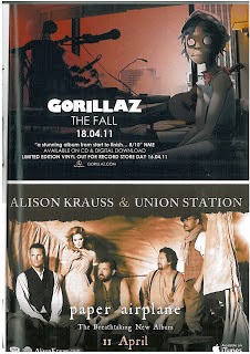 Conventions of a magazine advertisement for the release of a new album typically include the band's name, the title of the album, endorsements or taglines, the platform on which the album is released, the release date and some kind of specially created artwork that ties in nicely with the themes incorporated on the digipak and the music video. The adverts typically include the record label as well as an artist's website. Both of the adverts shown here have these features, despite being fairly different artists with different levels of success. Gorillaz are a well known group whereas Alison Krauss & Union Station are less of a commonly known artist. The artwork styles vary considerably too - whilst the artwork for 'The Fall' is much more cartoon-like and features concept art, in contrast to that for 'Paper Airplane', which has a much more realistic style with the sepia photograph. I think the covers are also reminiscent of the styles of music that they are advertising. The title track for 'Paper Airplane' is shot to have a very similar style of visual to the advert - as can be seen below. The way that the people are dressed in the advert is easy to relate to that in the video and to the style of music - the music is a mix of country/folk music and they are dressed in outfits that are related to this; with simple clothing and old style waistcoats and facial hair. The font of the advert can be linked to the music, as it is a serif, simple font that would be used when trying to represent 'old style'.
  In comparison, the advert for the Gorillaz reflects a far more modern style of music. One track from this album, titled Phoner To Arizona seems to suit the artwork well, with a very modern style of music, and soundbites in it that suit the cartoon on the advert (which looks dishevelled and a little creepy with the completely white eyes). The fonts for this advert are sans-serif and I like the way that there is contrast between the band's name and the rest of the font on the advert. This has turned the bands name into a logo almost, and makes it stand out in comparison to the rest of the text. I think this is helpful because there is contrast between the two, and the most important aspects of the advert are highlighted - the band name and the release date. However, this may only work for very popular bands - for instance, the loyal Gorillaz fan base would see the band's name and the date and know they want to buy the album.
  I think the one for Alison Krauss & Union Station's album is probably trying to create a band image - for one, they feature on it themselves, which is something a lot of music videos for new acts have. More popular and well established groups, like the Gorillaz, can afford to have concept artwork for their advert.
However this convention for music videos may not necessarily follow through to the adverts for the albums on which they feature. This magazine advert for the Foo Fighters 'Wasting Light' shows various members of the band, albeit in an abstract way. The Gorillaz advert shows a member of the band as they appear in their music videos, despite not actually being the real person singing/performing.
The fonts here are all similar. As this is a full page advert, the vertical nature allows for there to be a much more typical poster advertisement style - it looks as though it could be an advertisement for a film. The large typography of the band's name is good because of the way that it draws attention to them, and the very bright colours on the much darker background is very eye-catching.
Again there are some common themes - the website where you can buy the band's music, some credentials and logos including that of the record label.
The unusual graphic is quite eyecatching and once you see one face you're drawn in to looking at them all. In a way, it helps you to feel as though you're quite familiar with the band as you know their faces.
Digipak Planning - Cover
When I first started planning my digipak design, I had the idea of using a lightbulb in the same way that the Lafontaines' previous album artworks featured a shark's fin and blocks (see this post) because it carried a youthful feel to it.
I took to Microsoft Paint to have a play around to see how certain designs would look and to test out which fonts I liked.
I decided to use the font Droidiga as it was my favourite and on my kwiksurvey poll it was the most popular choice, other than Basic Title Font, which was not one that I wanted to use for the design I had decided to use - it seemed to light and I wanted a heavier font.
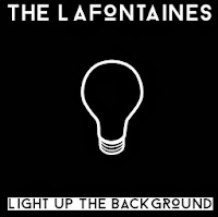 My first design was this: I found a simple outline for a lightbulb, something I had decided to look into using on the cover, and I inverted the colours so that it was going to fit the black background more.
I liked the contrast between the two titles, and I think it makes them each stand out respectively. The band's name stands out very clearly on a black background.
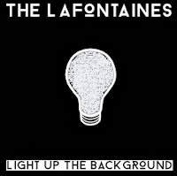 However, I thought this design was a little too simple and so I decided to change it a little bit. I used the exact same design, but this time I filled in the lightbulb. Due to having found the design online, the middle of the bulb would not fill completely due to areas being slightly different colours - on Microsoft Paint it only recognises one precise shade as the one you want to fill, so it came up with an interesting effect, as can be seen here. The scribbled look of the lightbulb reminds me slightly of the Mr Freeman aspect to my video as they are hand-drawn designs.
Whilst the design looks good from a distance, the colouring in looks tacky and like a design error. If I was to do a design like this for my cover, I might instead emulate the messy colouring in by doing it on a tablet or through scanning it into the computer.
My next few designs were changing certain aspects around, such as the band's name being in black and the title being in white, the background being white instead and the lightbulb being a multitude of colours.
 I then thought I would actually not have the title in black at the bottom, and make them both white over a black background. This seemed a lot cleaner and also a lot more attractive when I started to look at using photographs instead - mainly in order to add another dimension to the covers, which were looking quite flat and boring due to the fact there were only two shades of colour.
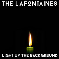
I found a photograph of a candle online. I am aware that I am not allowed to use any found images in my print production, but I am only using found images in my planning - I will draw or capture the images myself in the real product.
This cover felt a lot more like a real album cover to me, with the flame almost warming the space around it and making it look far less two-dimensional.
I would probably use a different coloured candle if I were to emulate this design in my print production, drawing on previous colour schemes that I've found in their previous products - such as blue, red, coral or grey.
However, my concern here was that the candle was a little too religious for my liking - it looked almost too controlled and reminded me of a vigil - the title track is not fitting to this and I didn't want the cover to be misleading to an audience. This is likely due to the colour of the candle itself but also because of the symbolism of a flame shown in this way.
I then looked to other sources of light (I made the decision to draw on the first word of the title for an image as their single 'Shark In The Water' has a shark's fin on, almost like a dingbat - so I wanted it to be quite literal), and decided to look into how a lighter may look - I want to use this icon in my music video anyway, so it seemed appropriate to use it as a graphic on the title.
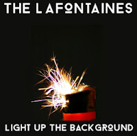 Here, the background colour has changed a little - it is slightly more green than the previous ones. However, I like this as it yet again adds a little more depth and variety to the cover. This is a found image as well - I would look into emulating this in my own cover. This image is appropriate to the song in my eyes as it is suggesting a little rebellion and the spark of something; perhaps the spark that sets something big off. It is a much more exciting image in terms of the semiology attached to it and creates somewhat of a sense of danger. However, the colours of this picture also give off a sense of fun, too (the pinks and purples amongst the orange and white spark)
 I like this design the most out of the ones I have shown on this post. I think it has quite a lot of depth of tone and the picture is interesting to look at.
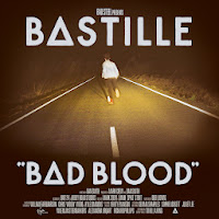
The design reminds me somewhat of the cover for Bastille's Bad Blood - this is likely due to the font having unusual letters - like the 'o' is different to how it looks in most typefaces, akin to the unusual 'a' in Bad Blood.
 I also decided to do a mock-up of a back cover too. I followed through with the theme from the front - sparks and light, and then found an image which I felt looked good when I put the track listing over it.
I preferred the look of the text being inside a black box because not only did it help the letters to stand out against the image, but it also gave it quite a modern feel - and since they are a modern band I felt this was important.
I took to Microsoft Paint to have a play around to see how certain designs would look and to test out which fonts I liked.
I decided to use the font Droidiga as it was my favourite and on my kwiksurvey poll it was the most popular choice, other than Basic Title Font, which was not one that I wanted to use for the design I had decided to use - it seemed to light and I wanted a heavier font.
 My first design was this: I found a simple outline for a lightbulb, something I had decided to look into using on the cover, and I inverted the colours so that it was going to fit the black background more.
 I liked the contrast between the two titles, and I think it makes them each stand out respectively. The band's name stands out very clearly on a black background.
 However, I thought this design was a little too simple and so I decided to change it a little bit. I used the exact same design, but this time I filled in the lightbulb. Due to having found the design online, the middle of the bulb would not fill completely due to areas being slightly different colours - on Microsoft Paint it only recognises one precise shade as the one you want to fill, so it came up with an interesting effect, as can be seen here. The scribbled look of the lightbulb reminds me slightly of the Mr Freeman aspect to my video as they are hand-drawn designs.
Whilst the design looks good from a distance, the colouring in looks tacky and like a design error. If I was to do a design like this for my cover, I might instead emulate the messy colouring in by doing it on a tablet or through scanning it into the computer.
My next few designs were changing certain aspects around, such as the band's name being in black and the title being in white, the background being white instead and the lightbulb being a multitude of colours.
 I then thought I would actually not have the title in black at the bottom, and make them both white over a black background. This seemed a lot cleaner and also a lot more attractive when I started to look at using photographs instead - mainly in order to add another dimension to the covers, which were looking quite flat and boring due to the fact there were only two shades of colour.
 I found a photograph of a candle online. I am aware that I am not allowed to use any found images in my print production, but I am only using found images in my planning - I will draw or capture the images myself in the real product.
This cover felt a lot more like a real album cover to me, with the flame almost warming the space around it and making it look far less two-dimensional.
I would probably use a different coloured candle if I were to emulate this design in my print production, drawing on previous colour schemes that I've found in their previous products - such as blue, red, coral or grey.
However, my concern here was that the candle was a little too religious for my liking - it looked almost too controlled and reminded me of a vigil - the title track is not fitting to this and I didn't want the cover to be misleading to an audience. This is likely due to the colour of the candle itself but also because of the symbolism of a flame shown in this way.
I then looked to other sources of light (I made the decision to draw on the first word of the title for an image as their single 'Shark In The Water' has a shark's fin on, almost like a dingbat - so I wanted it to be quite literal), and decided to look into how a lighter may look - I want to use this icon in my music video anyway, so it seemed appropriate to use it as a graphic on the title.
 Here, the background colour has changed a little - it is slightly more green than the previous ones. However, I like this as it yet again adds a little more depth and variety to the cover. This is a found image as well - I would look into emulating this in my own cover. This image is appropriate to the song in my eyes as it is suggesting a little rebellion and the spark of something; perhaps the spark that sets something big off. It is a much more exciting image in terms of the semiology attached to it and creates somewhat of a sense of danger. However, the colours of this picture also give off a sense of fun, too (the pinks and purples amongst the orange and white spark)
 I like this design the most out of the ones I have shown on this post. I think it has quite a lot of depth of tone and the picture is interesting to look at.
The design reminds me somewhat of the cover for Bastille's Bad Blood - this is likely due to the font having unusual letters - like the 'o' is different to how it looks in most typefaces, akin to the unusual 'a' in Bad Blood.

I preferred the look of the text being inside a black box because not only did it help the letters to stand out against the image, but it also gave it quite a modern feel - and since they are a modern band I felt this was important.
Wednesday, 9 October 2013
 0%
0%Tuesday, 8 October 2013
Props
I have recently purchased a pair of metal handcuffs for use in my video - I will be using these for a brief shot and hence I have not purchased anything too expensive.

The remainder of the props will all be provided by cast members - such as Max's clothes, his bmx equipment, and things such as the cigarettes can be provided by my friend.
The remainder of the props will all be provided by cast members - such as Max's clothes, his bmx equipment, and things such as the cigarettes can be provided by my friend.
Wednesday, 2 October 2013
Teddy Boys News Coverage

She also refers to them as 'nauseating', claiming that they make people feel physically ill when they encounter the Teddy Boys. This is followed up by them being referred to as 'specimens', which brings to mind thoughts of a lab experiment. This takes away their humanity as they are being referred to as something kept in a jar in a lab, such as a frog or blood slide. It suggests that, like a lab experiment, the Teddy Boys ought to be looked at and closely examined from afar, in the interests of safety.
She believes that local authorities ought to 'remove' them, as though the subculture is a piece of graffiti or something else unpleasant that has been left on the streets. It is a very clinical term and shows just how detached and uncaring Mrs Starr feels towards the Teddy Boys.
Another article, from the Sunday Chronicle two weeks before is titled "Gangs Menace Report". This opens with the words '"Edwardian" spivs'. The word 'spiv' looks and seems to be similar to the more modern word 'chav', and is certainly being used as a derogatory term or slur.
The article claims that Brighton and Hove has been 'terrorised' by the Teddy Boys. This suggests that they are something that causes absolute terror, not just fear amongst the general population. They are portrayed as being worse than monsters almost, which is a big label to have placed on a person.
The article then mentions the police having to 'cope' with the threatened 'invasion' of the Teddy Boys. It seems to be inferring that the Teddy Boys coming to Brighton and Hove carries a big threat with emotional implications, and the use of the word 'invasion' shows that the subculture is going somewhere they aren't supposed to be going and that they are some kind of alien to the area - again, something scary and not something about which people have much knowledge (potentially why they feel so threatened and terrorised in the first place.)
The article talks about 'savage battles', suggesting that they are wild and uncontrollable. The word 'savage' suggests that they weren't raised properly and have a wild side, causing them to be violent and brutal in their actions.
The clothing worn by the Teddy Boys is referred to as a 'thugs uniform', bringing to mind thoughts of premediated and organised crime, akin to how the mafia is seen to wear sharp suits. It reinforces the idea of being a Teddy Boy as having an identity and a role. They are seen as being more of a serious subculture if they have a dress code.
The article claims that local business people 'dread their arrival', suggesting that the Teddy Boy's visit often and cause trouble every single time.
Subscribe to:
Posts (Atom)