I took to Microsoft Paint to have a play around to see how certain designs would look and to test out which fonts I liked.
I decided to use the font Droidiga as it was my favourite and on my kwiksurvey poll it was the most popular choice, other than Basic Title Font, which was not one that I wanted to use for the design I had decided to use - it seemed to light and I wanted a heavier font.
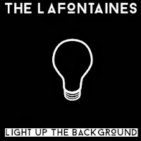 My first design was this: I found a simple outline for a lightbulb, something I had decided to look into using on the cover, and I inverted the colours so that it was going to fit the black background more.
 I liked the contrast between the two titles, and I think it makes them each stand out respectively. The band's name stands out very clearly on a black background.
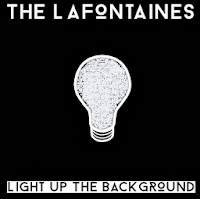 However, I thought this design was a little too simple and so I decided to change it a little bit. I used the exact same design, but this time I filled in the lightbulb. Due to having found the design online, the middle of the bulb would not fill completely due to areas being slightly different colours - on Microsoft Paint it only recognises one precise shade as the one you want to fill, so it came up with an interesting effect, as can be seen here. The scribbled look of the lightbulb reminds me slightly of the Mr Freeman aspect to my video as they are hand-drawn designs.
Whilst the design looks good from a distance, the colouring in looks tacky and like a design error. If I was to do a design like this for my cover, I might instead emulate the messy colouring in by doing it on a tablet or through scanning it into the computer.
My next few designs were changing certain aspects around, such as the band's name being in black and the title being in white, the background being white instead and the lightbulb being a multitude of colours.
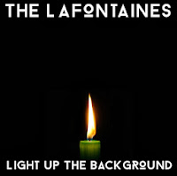 I then thought I would actually not have the title in black at the bottom, and make them both white over a black background. This seemed a lot cleaner and also a lot more attractive when I started to look at using photographs instead - mainly in order to add another dimension to the covers, which were looking quite flat and boring due to the fact there were only two shades of colour.
 I found a photograph of a candle online. I am aware that I am not allowed to use any found images in my print production, but I am only using found images in my planning - I will draw or capture the images myself in the real product.
This cover felt a lot more like a real album cover to me, with the flame almost warming the space around it and making it look far less two-dimensional.
I would probably use a different coloured candle if I were to emulate this design in my print production, drawing on previous colour schemes that I've found in their previous products - such as blue, red, coral or grey.
However, my concern here was that the candle was a little too religious for my liking - it looked almost too controlled and reminded me of a vigil - the title track is not fitting to this and I didn't want the cover to be misleading to an audience. This is likely due to the colour of the candle itself but also because of the symbolism of a flame shown in this way.
I then looked to other sources of light (I made the decision to draw on the first word of the title for an image as their single 'Shark In The Water' has a shark's fin on, almost like a dingbat - so I wanted it to be quite literal), and decided to look into how a lighter may look - I want to use this icon in my music video anyway, so it seemed appropriate to use it as a graphic on the title.
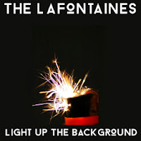 Here, the background colour has changed a little - it is slightly more green than the previous ones. However, I like this as it yet again adds a little more depth and variety to the cover. This is a found image as well - I would look into emulating this in my own cover. This image is appropriate to the song in my eyes as it is suggesting a little rebellion and the spark of something; perhaps the spark that sets something big off. It is a much more exciting image in terms of the semiology attached to it and creates somewhat of a sense of danger. However, the colours of this picture also give off a sense of fun, too (the pinks and purples amongst the orange and white spark)
 I like this design the most out of the ones I have shown on this post. I think it has quite a lot of depth of tone and the picture is interesting to look at.
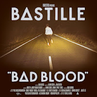
The design reminds me somewhat of the cover for Bastille's Bad Blood - this is likely due to the font having unusual letters - like the 'o' is different to how it looks in most typefaces, akin to the unusual 'a' in Bad Blood.
I also decided to do a mock-up of a back cover too. I followed through with the theme from the front - sparks and light, and then found an image which I felt looked good when I put the track listing over it.
I preferred the look of the text being inside a black box because not only did it help the letters to stand out against the image, but it also gave it quite a modern feel - and since they are a modern band I felt this was important.


No comments:
Post a Comment